Druid Sneak Peek: Graphical Data Exploration
Druid’s unified console is mostly directed at data management. Among other things, you can control your ingestion tasks, manage segments and their compaction settings, monitor services, and there is also a query manager GUI that understands both SQL and Druid native queries.
For data visualization, up until now you had to use external tools such as Superset or Tableau, or Imply’s own Pivot that comes bundled with the commercial distribution of the software.
But this is going to change. Druid 28 is going to add an exploration GUI that allows visual analysis of data!
This is a sneak peek into Druid 28 functionality. In order to use the new functions, you can (as of the time of writing) build Druid from the HEAD of the master branch:
git clone https://github.com/apache/druid.git
cd druid
mvn clean install -Pdist -DskipTests
Then follow the instructions to locate and install the tarball.
Disclaimer: This tutorial uses undocumented functionality and unreleased code. This blog is neither endorsed by Imply nor by the Apache Druid PMC. It merely collects the results of personal experiments. The features described here might, in the final release, work differently, or not at all. In addition, the entire build, or execution, may fail. Your mileage may vary.
For this post, I ingested the Wikipedia sample data, as described in the quickstart tutorial. You are of course encouraged to try out different data sets with the new explorer.
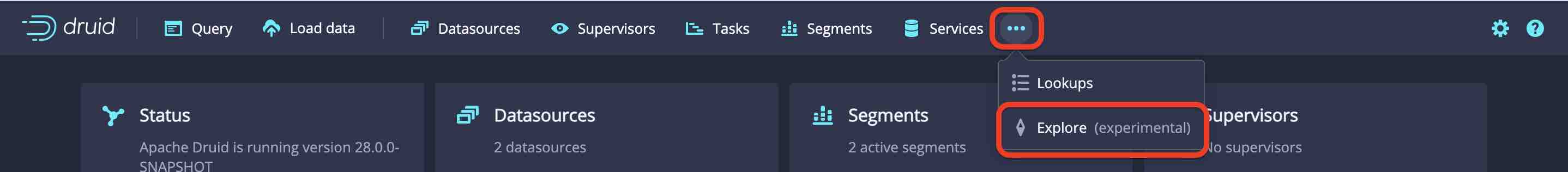
How to access the Explorer view
To access the data explorer, go to the three dots ... right next to the Services tab, open the menu and click Explore:
You will be greeted with a canvas in the middle, and surrounding GUI controls:
- In the top left field you select the datasource (table) that you wish to explore.
- As soon as a datasource is selected, the left panel shows a list of all fields as they occur in the datasource. This does not care whether the fields are dimensions or metrics.
- In the top bar you can set filters. Time filters come with an option of relative or absolute times. For character values, there is a regular expression filters as well as the ability to pick literal values.
- In the right panel you choose one of the supported visualization types. Depending on your selection, different configuration options appear below. There’s also a
...button, behind which you can find the query history list. This is handy if you want to know which SQL queries are generated by the Explorer.
Let’s go through the list of visualization types.
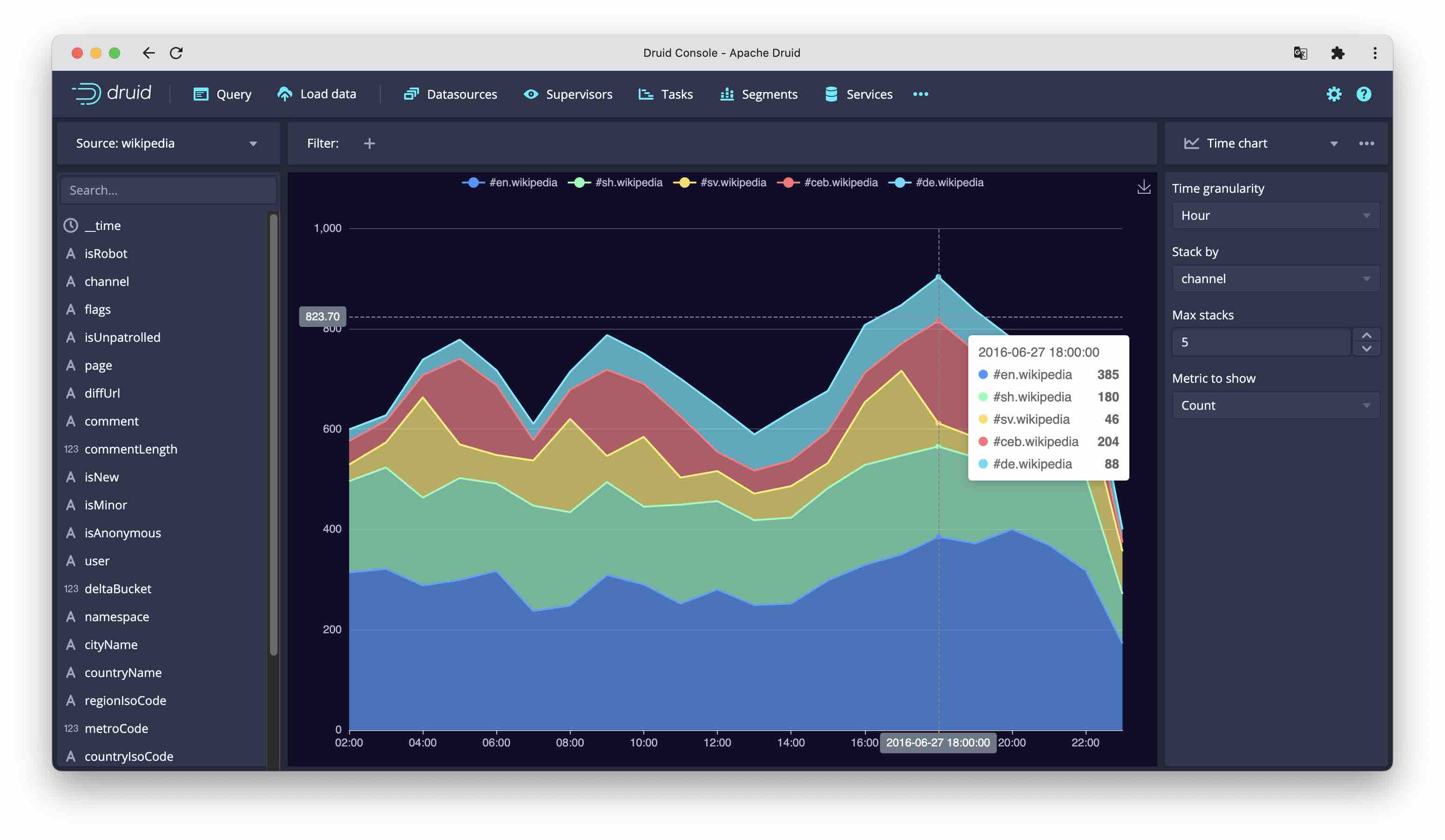
Time chart
The Time chart visualizes the development of a metric over time. This is an area chart, or optionally (if you select a dimension to stack by) a stacked area chart.
It is possible to limit the number of items to be displayed in the stacked dimension.
This visualization allows selecting as metrics:
- total count
- unique count of any column
- minimum and maximum of timestamp
- for numeric columns, moreover, the standard aggregators sum, min, max, and 98 percentile.
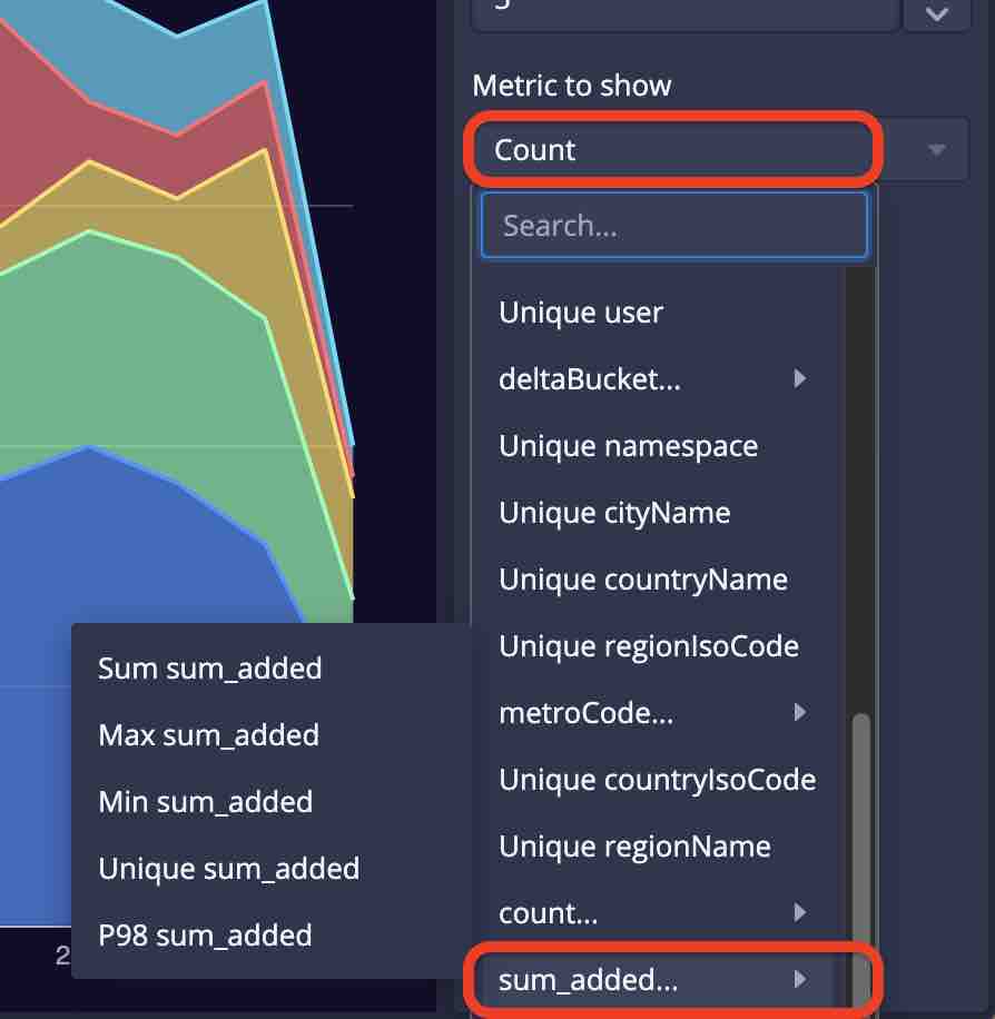
This mechanism of selecting metrics is the same for all other visualizations, too.
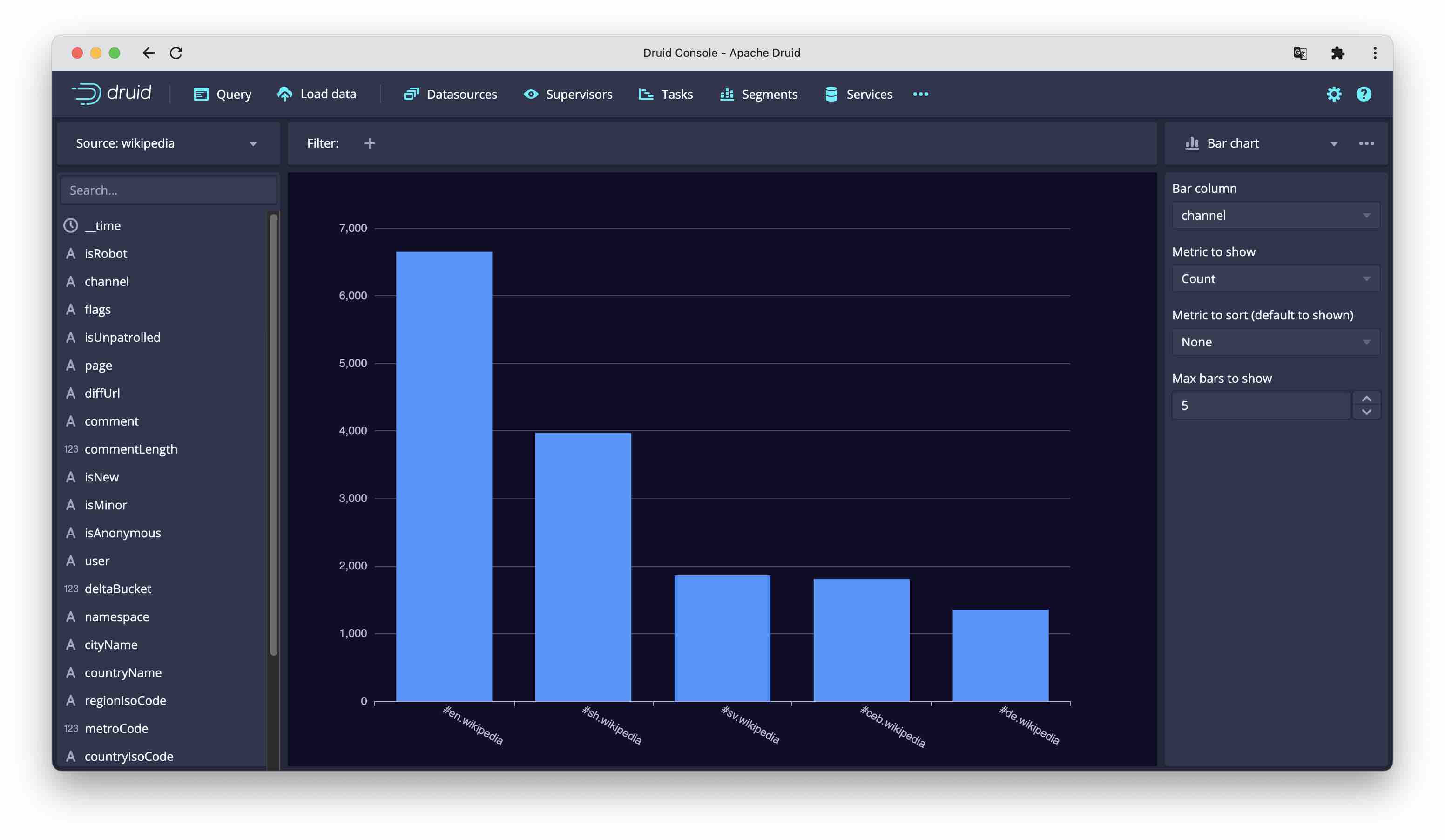
Bar chart
The bar chart displays one bar column (dimension) and one metric, It is possible to sort by a metric other than the one displayed.
Table
The table chart has the most flexibility in selecting and arranging table fields. These are the options:
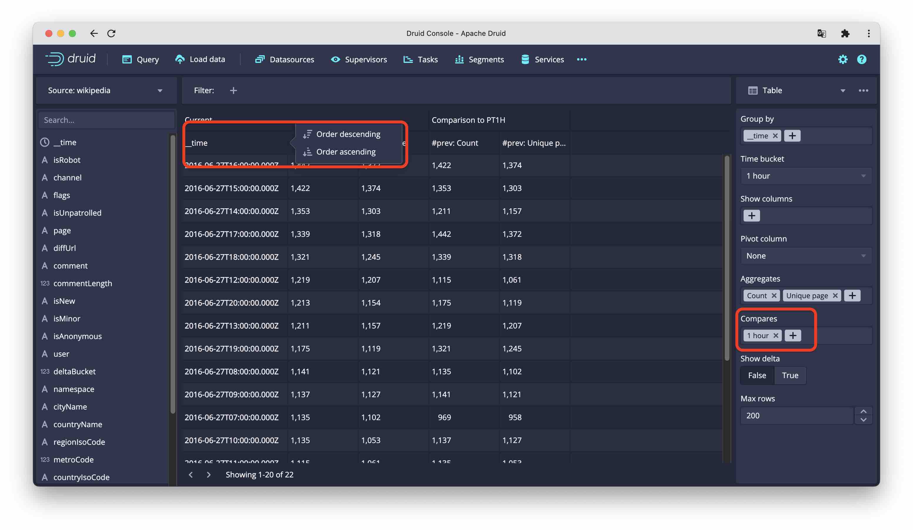
- Group by: These are your regular BI dimensions, things to aggregate by. While all discrete dimensions just create one row by per value,
__timehas builtin intelligence when you select this, you can select the bucketing (granularity). You can select multiple dimension columns. - Show: can show a column without aggregating by that column. You could view this as interpreting a dimension as a metric where you pick either the latest value or the number of values. You can add multiple columns here, too.
- Pivot: This displays a dimension across instead of down. The query mechanism is a bit different: it currently uses filtered metrics with one expression per dimension value.
- Aggregates: These are the metrics, the selection is the same as for the time chart. But you can have multiple metrics.
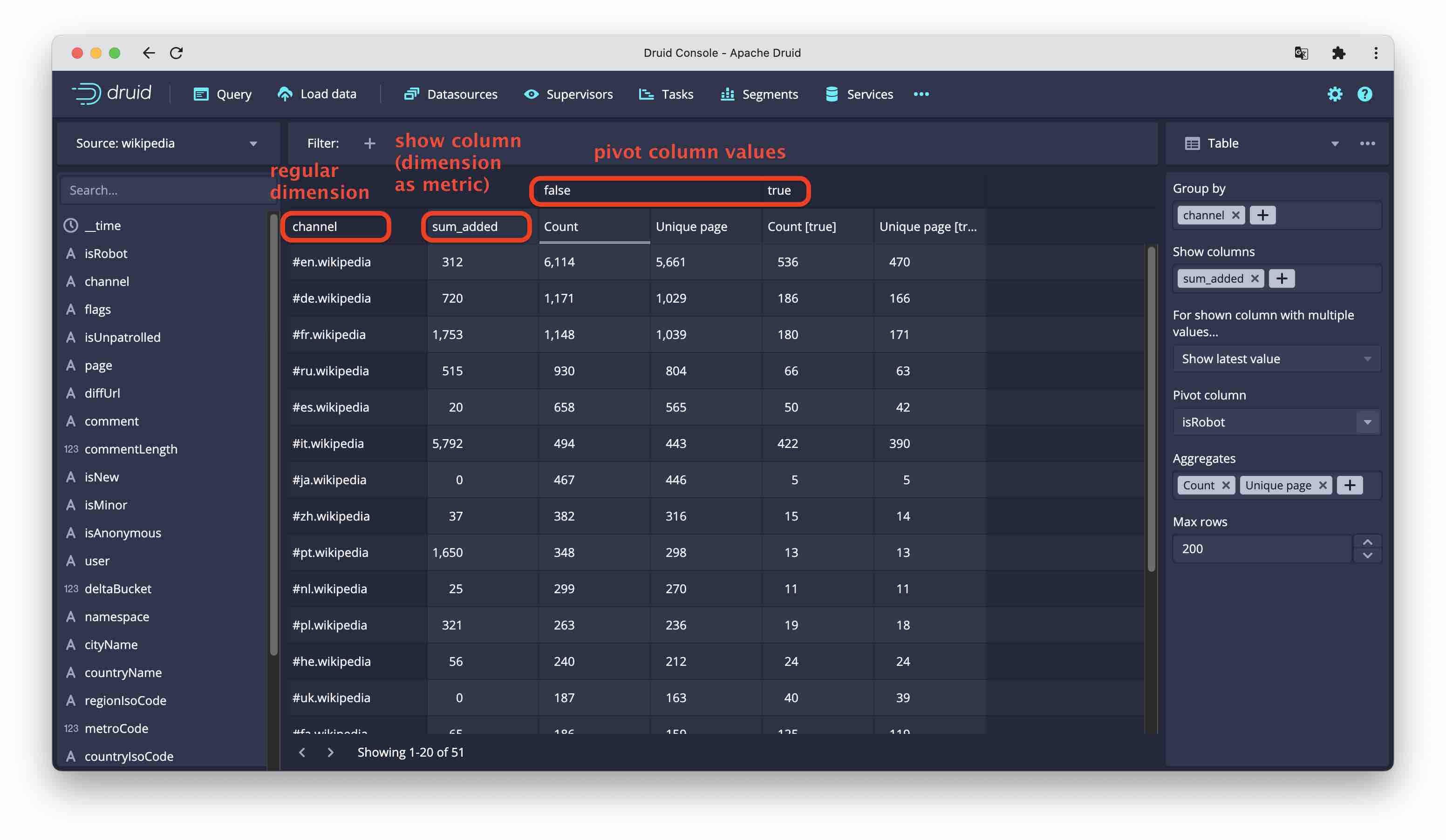
- Compares: compare by time interval. You can include multiple comparisons. But Compare and Pivot are for now mutually exclusive.
You can sort by any column if you click on the column header.
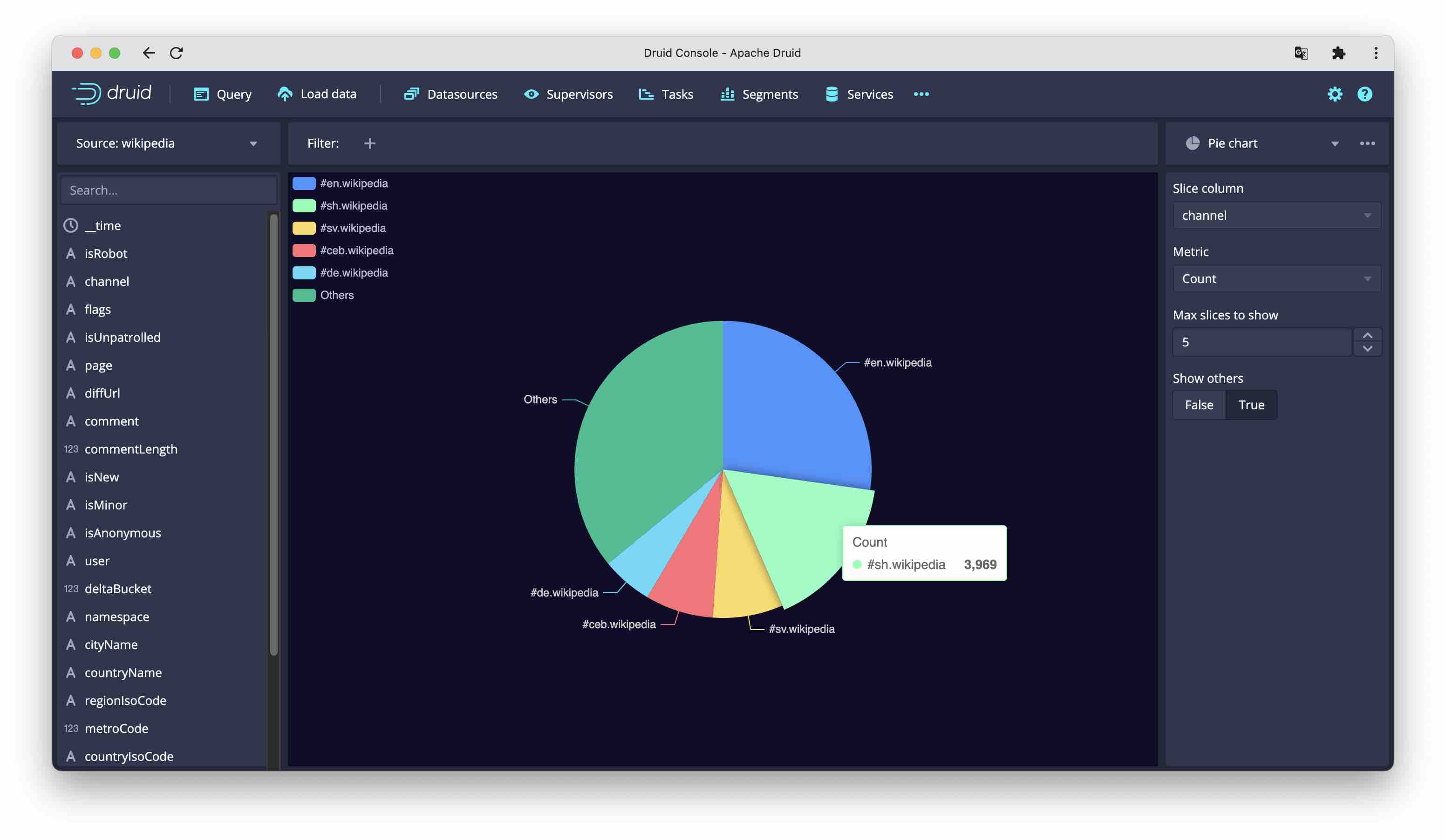
Pie chart
This displays one metric, broken down by one dimension. You can specify the number of named slices, the rest goes into Other.
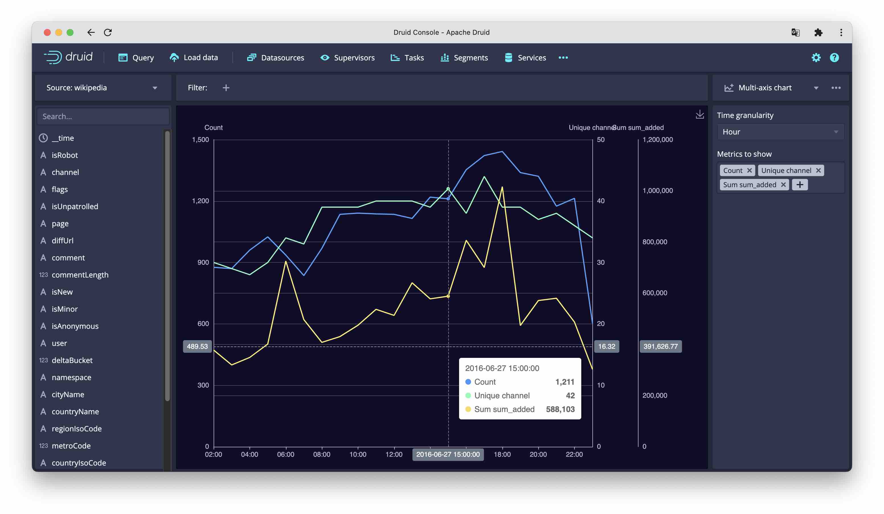
Multi-axis chart
This is a variety of the time chart, but with many metrics. They are drawn as line charts, overlayed and each to its own scale. The first metric’s axis is displayed to the left, all others are displayed to the right of the chart.
Conclusion
In this post, I have shown a glimpse of the upcoming data exploration GUI that is built right into Druid. While this is currently not a replacement for a full BI suite, it is a valuable tool for the data engineer to get a better idea of how the data looks like. This can assist in understanding the distribution of the data and optimizing the data model inside Druid. It’s also valuable when an analysts asks the data team why a particular chart looks the way it does.
Note that the data explorer is not part of any official release (yet), and that it is likely going to change and evolve a lot. Feel free to experiment!