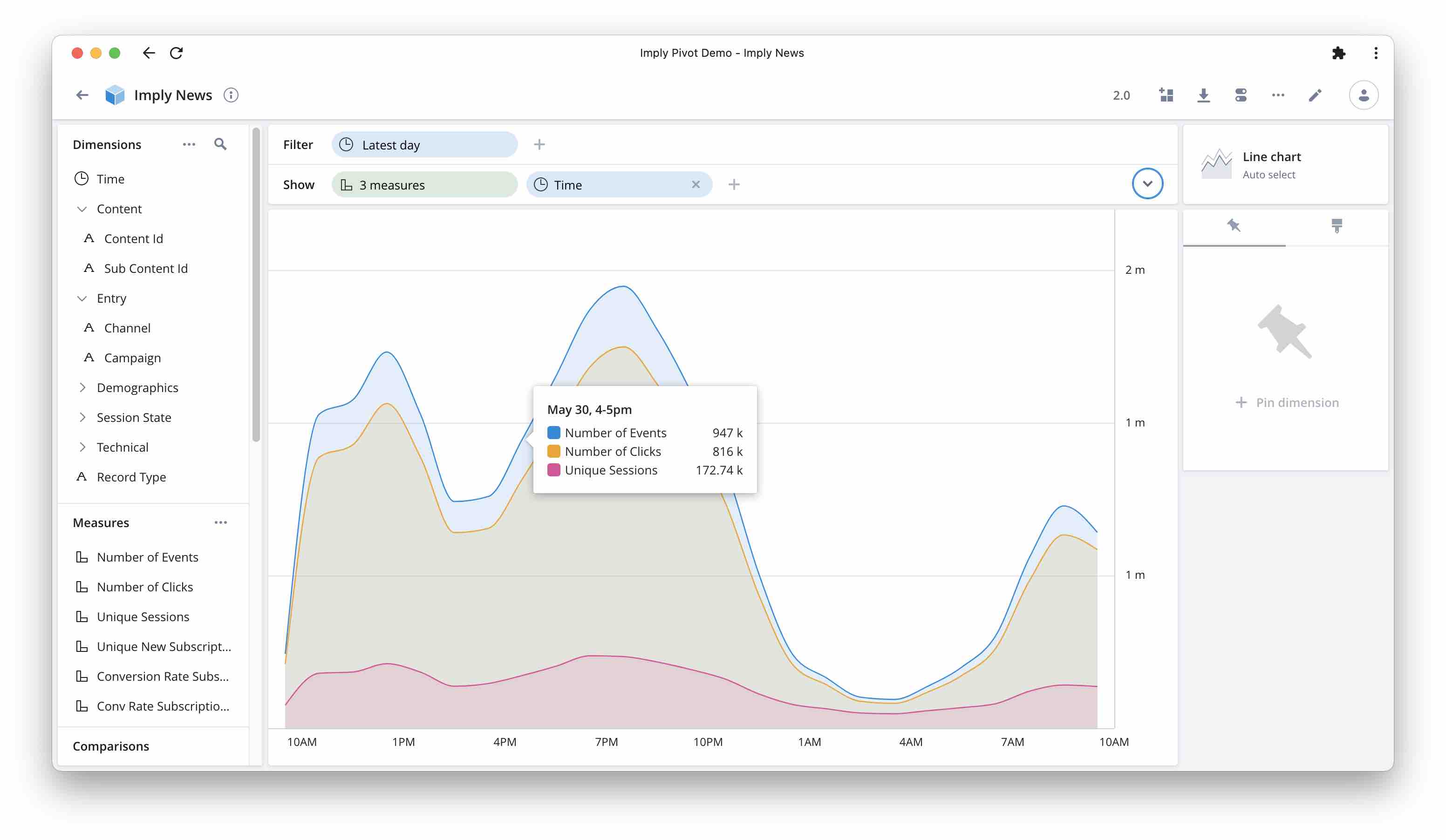
Overlaying Multiple Metrics in Imply Pivot
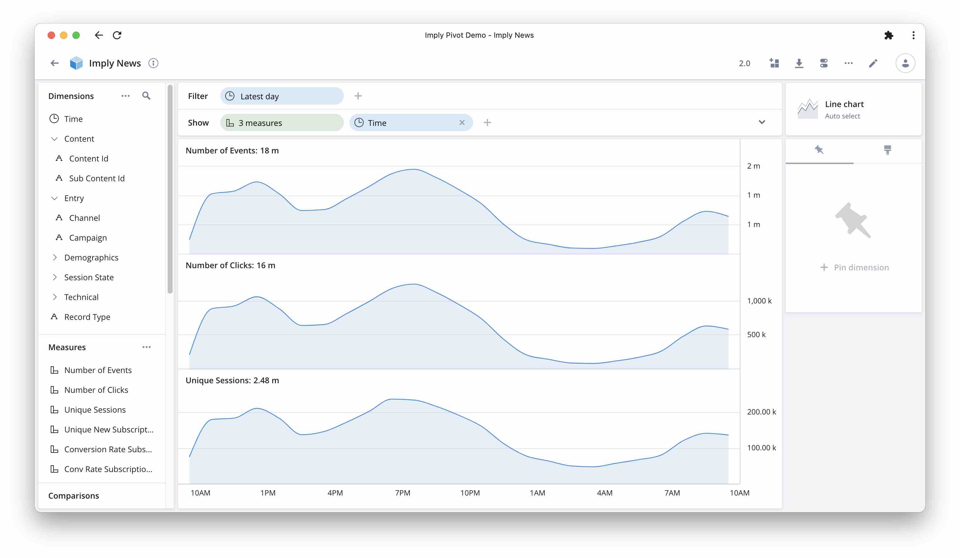
Today we are going to look at a new enhancement for line chart graphs in Imply’s Pivot, such as timeseries curves. Up until recently, one chart would only show a single measure1. If you pulled in multiple metrics, you would get each in its own chart, like this:
What analysts asked for was to have all curves overlaid in one chart, like in the screenshot at the beginning of this article.
This is possible now. But how do you go about it? Let’s have a look!
Two (or more) measures in one chart
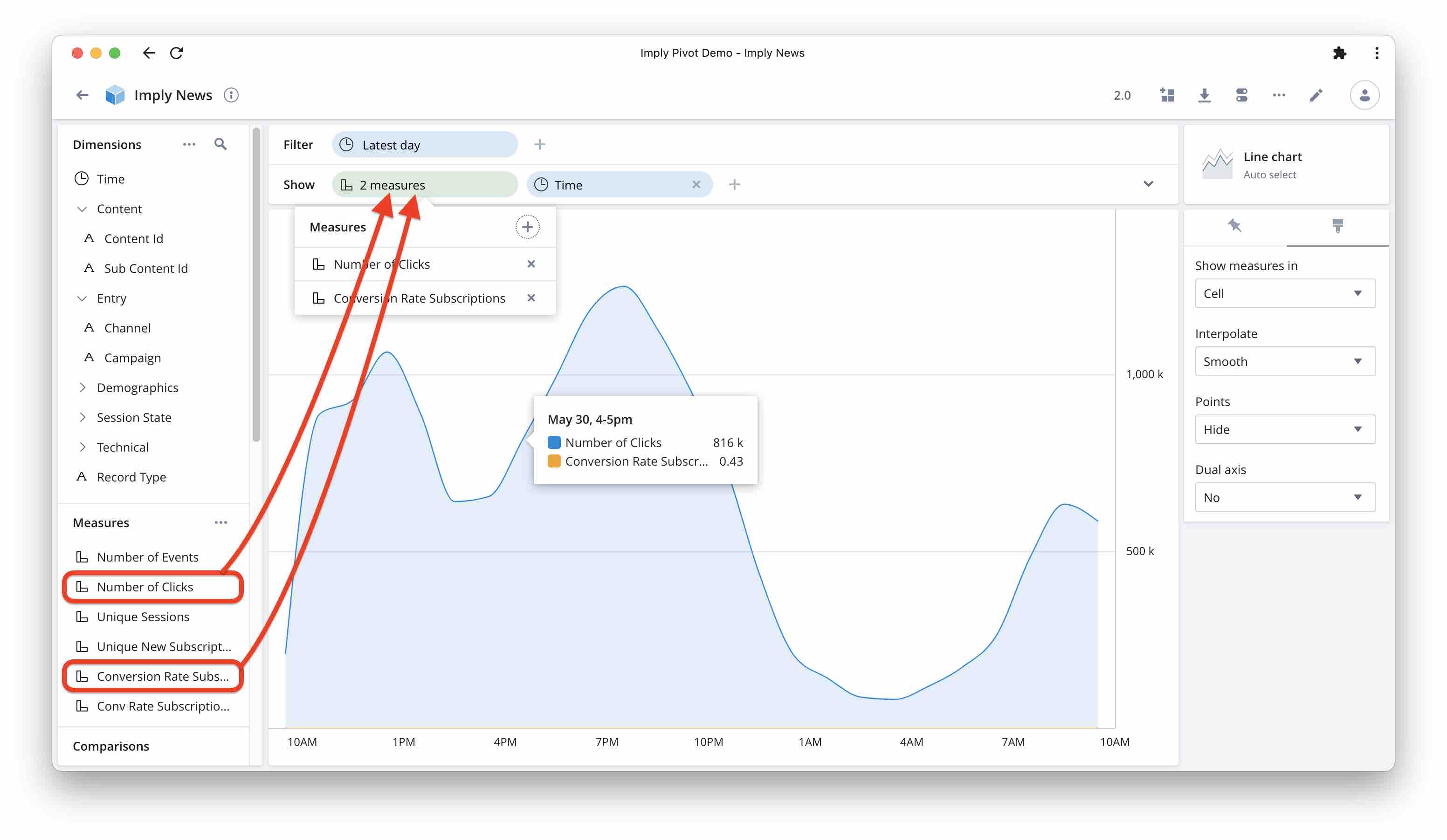
Here is how to show multiple measures in one chart. In this example, we are looking at clickstream data and we want to show the total number of events, the number of clicks, and the number of sessions.
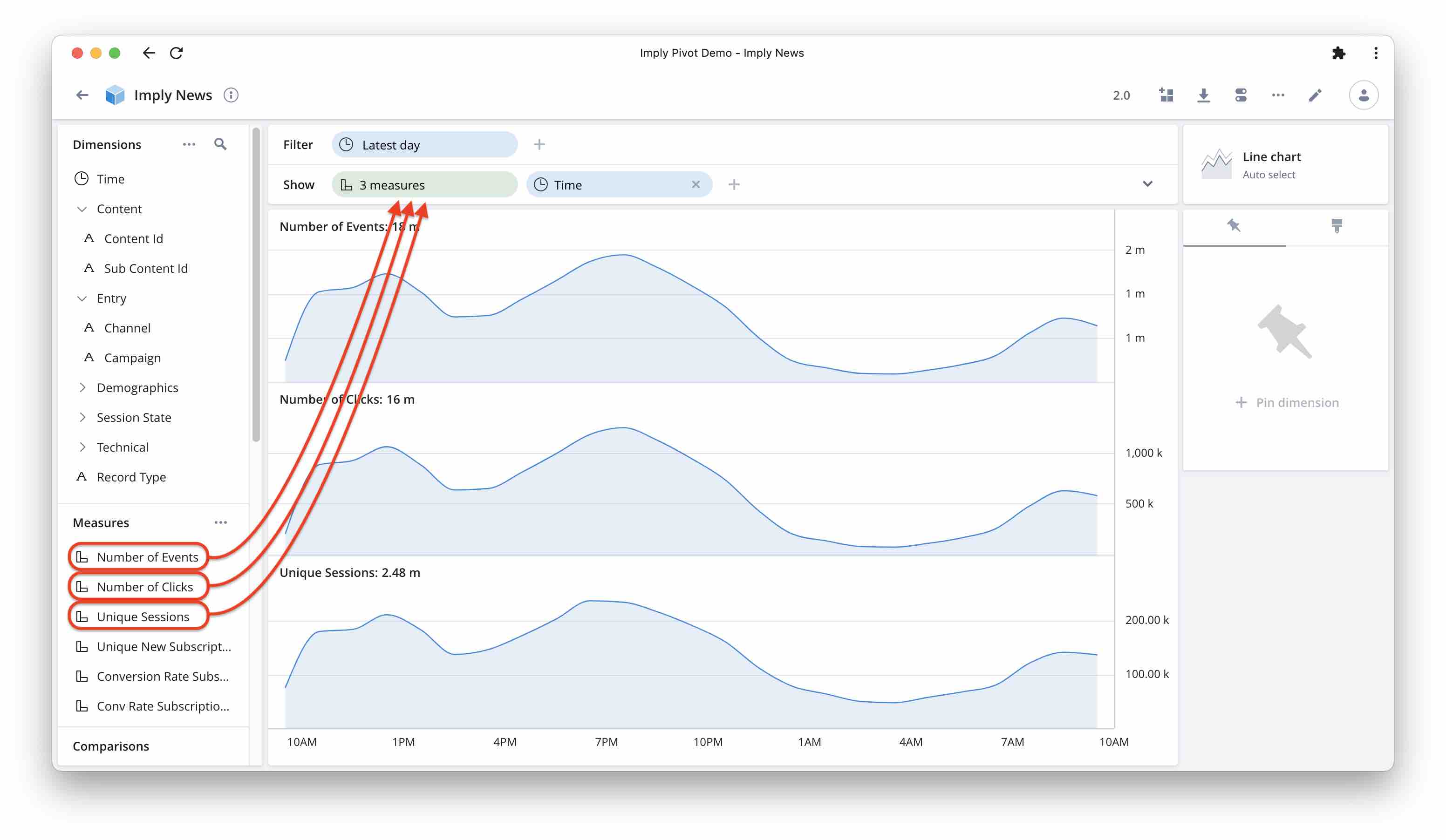
Drag all the measures you want to show into the show bar:
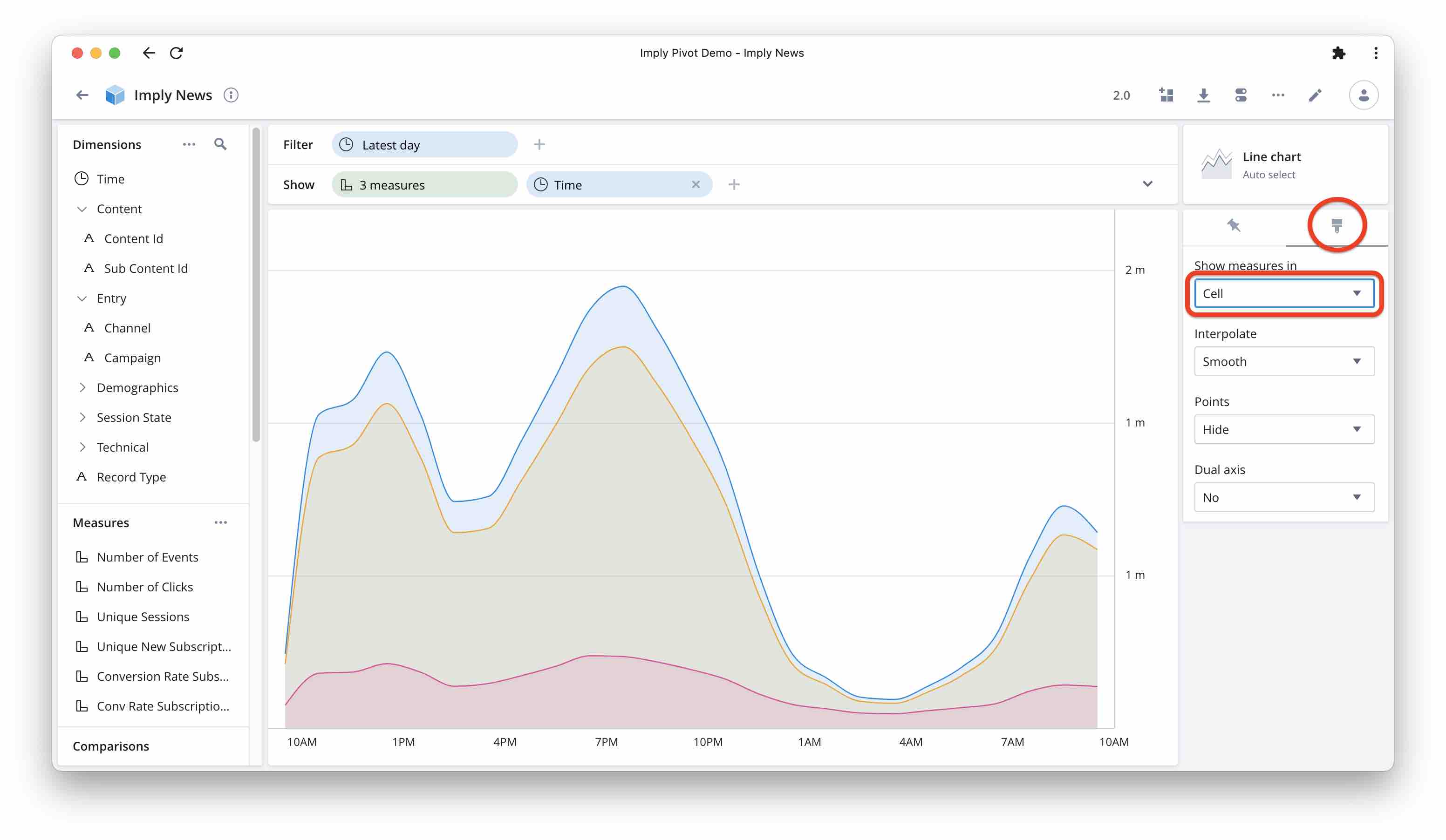
Select the paintbrush icon on the right sidebar and from the option menu, select “Show measures in” “Cell”:
This looks quite good. But what if the measures are to a vastly different scale?
Two measures with separate axis scaling
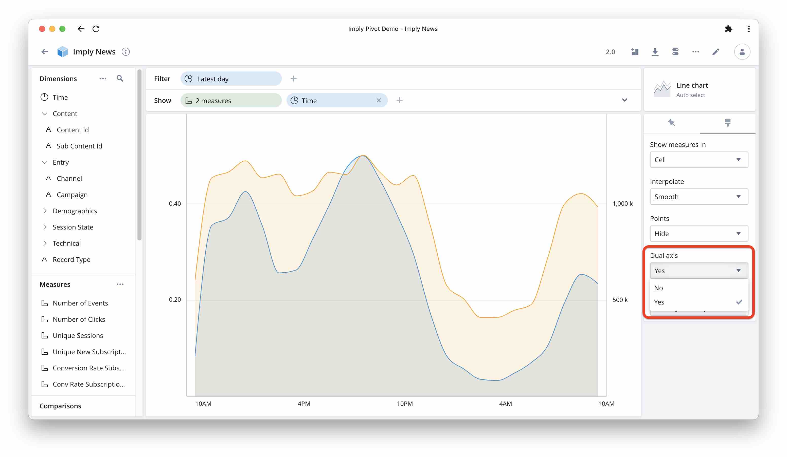
Let’s stick to the clickstream data and say we have a conversion goal and we want to look at both the total traffic and the conversion rate. We follow the same steps as before, but this time we use the number of clicks and the conversion rate as measures.
As you can see, the scales are so vastly different that the conversion rate all but disappears. But there is a solution: if you have only two measures you can show them on different axes so that both curves fill the canvas.
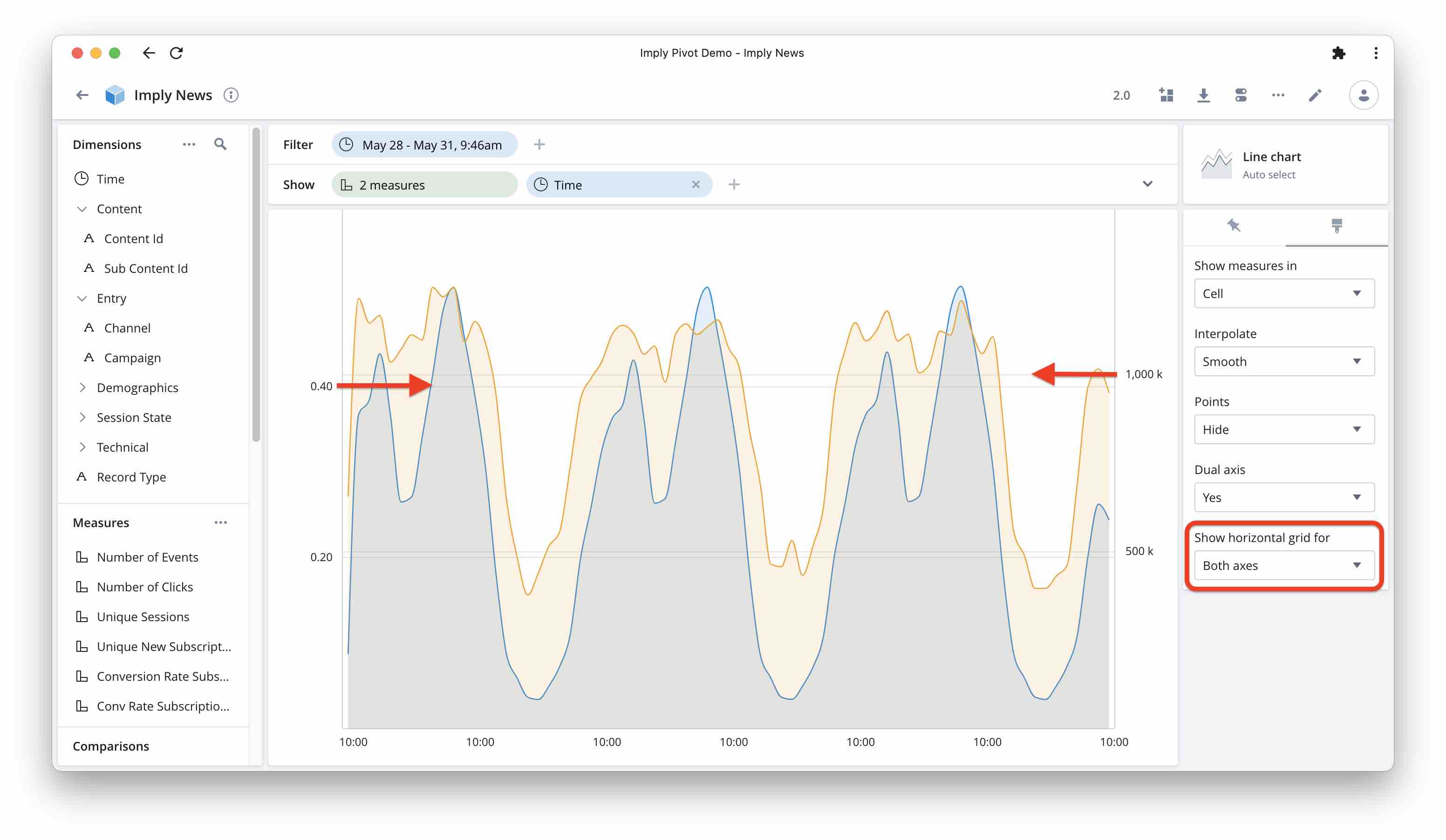
In the formatting options, choose whether you want to show horizontal grid line for both axes or only for the first:
Learnings
- Pivot can now display multiple line graphs in one chart.
- If you show more than two measures, they all share the same y axis scaling.
- If you show only two measures, you can scale the y axis for each of them independently.
-
You would be able to display a second measure as a dotted line using the comparison feature, but options are limited. ↩